Animations in R
Posted on Sun 02 December 2018 in Blog
I've recently discovered the package gganimate thanks to this brilliant example. I've been playing with the package during this weekend, and I created some examples that I spread through Twitter.
Some Twitter users showed interest in knowing more. I hope this short tutorial can satisfy them.
Libraries used
We're going to need the following libraries:
    # Numerical
    library(pracma) # To calculate the Taylor polynomials
    library(reshape) # For using melt

    # Display
    library(ggplot2) # For plotting
    library(ggthemes) # Also for plotting
    library(gganimate) # For animating. Install using devtools::install_github('thomasp85/gganimate')
    library(kableExtra) # To display nice tables
Animating a moving particle
Here we'll generate a moving particle. First, we need the positions in time. In our case, the dynamical equations will be given by:
So we generate the series and store them in a dataframe:
    ts <- seq(0, 2*pi, length.out = 100)
    xs <- cos(ts)
    ys <- sin(2*ts)

    particle <- data.frame(ts = ts, xs = xs, ys = ys)
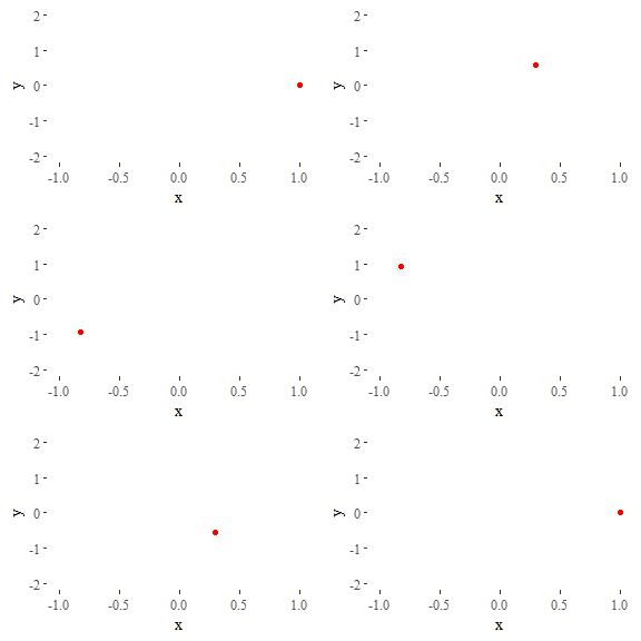
The code for generating the animation follows a very similar syntax to ggplot. In this case, we indicate that the values of ts should be used as the transition time.
    ggplot(data = particle) +
      geom_point(aes(x = xs, y = ys), col = 'red') + # Generate the plot
      theme_tufte() + # Make ...
      labs(x = 'x', y = 'y') + # ... it ...
      scale_y_continuous(limits = c(-2, 2)) + # ... look ...
      guides(col = FALSE) + # ... pretty.
      transition_time(ts) + # And animate!
      ease_aes('linear')

Animating a Taylor series
Let's see now a more complex example. Our purpose is to explore Taylor polynomials of different degrees approximating the function
around a given point.
Thus, we begin creating the function:
    f <- function(x) {
      cos(1.5*x)*exp(-x)
    }
In this case, we want to compare how good is the performance of Taylor polynomials of different orders. The data we have to generate is a bit more complex than before.
    xs <- seq(-2, 2*pi, length.out = 1500) # Values of x
    x0 <- 1 # Value of x where the Taylor series will be centered
    ys <- matrix(0, nrow = length(xs), ncol = 9)
    for(i in 1:9) { # Extract Taylor polynomials of orders 0 to 8
      order <- i - 1 # Indexes have to be positive, but first order is 0
      if(order == 0) { # A Taylor polynomial of order zero is just...
        ys[,i] <- f(x0) # ... a constant function
      } else {
        taylor_coefs <- taylor(f = f, x0 = x0, n = order) # Get polynomial
        ys[,i] <- polyval(taylor_coefs, xs) # Evaluate polynomial
      }
    }

    # Rewrite as dataframe
    df <- data.frame(ys)
    colnames(df) <- seq(0,8)
    df <- melt(df)
    df <- cbind(df, xs = rep(xs,9), f = f(xs))
    colnames(df) <- c('order', 'ys', 'xs', 'f')
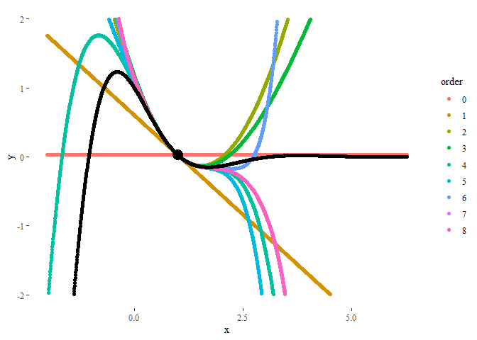
The resulting dataframe is a collection of polynomials of different orders evaluated at each point in xs. Additionally, we added the values of the original function f(x), also at each point:
| order | ys | xs | f |
|---|---|---|---|
| 0 | 0.0260228 | -2.000000 | -7.315110 |
| 0 | 0.0260228 | -1.994474 | -7.265955 |
| 0 | 0.0260228 | -1.988948 | -7.216622 |
| 0 | 0.0260228 | -1.983423 | -7.167120 |
| 0 | 0.0260228 | -1.977897 | -7.117454 |
| 0 | 0.0260228 | -1.972371 | -7.067632 |
A static plot will look like:
    ggplot(data = df) +
      geom_point(aes(x = xs, y = ys, col = order)) + # Generate basic plot
      geom_point(aes(x = xs, y = f)) + # Plot also original function
      geom_point(aes(x = x0, y = f(x0)), col = 'black', size = 5) + # Remark initial point
      theme_tufte() + # Make it ...
      labs(x = 'x', y = 'y') + # ... look ...
      scale_y_continuous(limits = c(-2, 2)) # ... pretty.

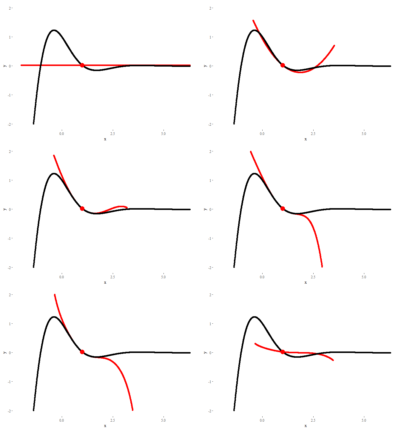
In order to animate it, now we will use the command transition_states, using order (the order of the Taylor polynomial) as the animation parameter. The parameters transition_length and state_length control how much time each state stays in screen, and how long the transition between states should look.
    ggplot(data = df) +
      geom_point(aes(x = xs, y = ys), col = 'red') + # Add basic plot
      geom_point(aes(x = xs, y = f)) + # Plot also original function
      geom_point(aes(x = x0, y = f(x0)), col = 'red', size = 5) + # Remark initial point
      theme_tufte() + # Make ...
      labs(x = 'x', y = 'y') + # ... it ...
      scale_y_continuous(limits = c(-2, 2)) + # ... look ...
      guides(col = FALSE) + # ... pretty.
      transition_states(order, transition_length = 1, state_length = 0.5) + # And animate!
      ease_aes('linear')

The result could not look nicer!
This entry appears in R-bloggers.com
PS: If you liked this post, this visualization I made in GeoGebra some time ago may also be of your interest.